A main challenge in science is effectively analyzing and displaying data to accurately and concisely convey information. Graphs can be generated in a spreadsheet service like Excel or Google Sheets, but this limits the adaptability of the graphs. There are many helpful packages in Python and other languages to visualize data. This post will give you a brief introduction to using Matplotlib for your data visualization needs.
Begin by installing Matplotlib and working in the python environment of your choice, either in a terminal, a python file, or an interactive Python notebook. You can install matplotlib using the instructions here. To follow along through the examples here, you will also need to install numpy.
For this demonstration, we’ll just go ahead and generate some random data using numpy.
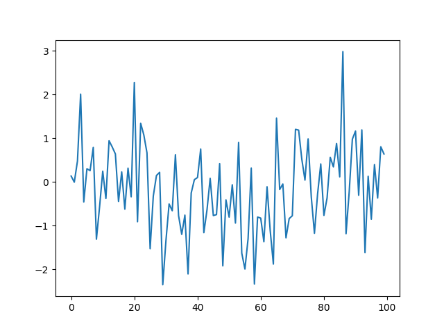
import numpy as np
x = np.random.randn(100)
For any dataset, you can use the built in plotting function of matplotlib to generate a line graph. With only one variable, the variable will appear on the y-axis with the index on the x-axis. Using the default plot configurations:
import matplotlib.pyplot as plt
plt.plot(x)
We get something like this:
(If you are running this from the terminal you can run plt.show() to show the graph.)
For a single variable graph, this is often not ideal, so we can plot a histogram instead and save the figure automatically with a convenient command. Again, we begin by using the default plotting option before adding customizations to it:
plt.hist(x)
You can save the histogram as a png file:
plt.savefig('hist.png')
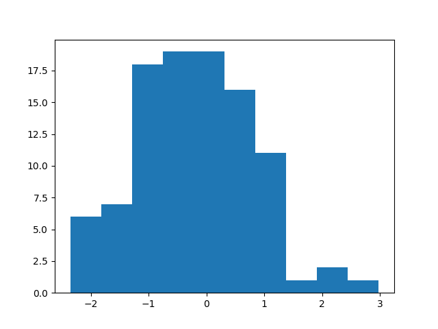
Now, we can customize the graph by adding a title and axis labels:
plt.xlabel('x value')
plt.ylabel('frequency')
plt.title('Histogram of x')
plt.savefig('hist_updated.png')

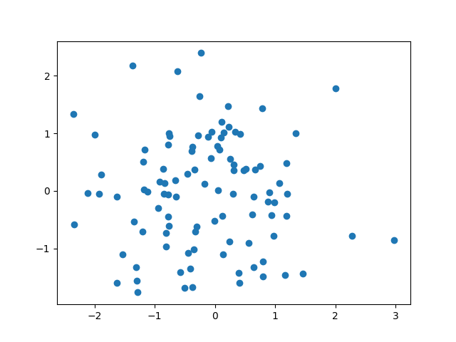
For another common type of graph, we’ll introduce a second variable.
x2=np.random.randn(100)
plt.scatter(x, x2)
plt.savefig('scatter.png')
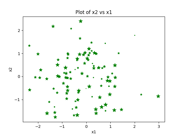
For a scatter plot, we can use keyword arguments to change the colors, size, and type of marker as well as adding axis labels and a title. When adding the size, we’ll generate another variable set of numbers with the same length as the dataset arrays.
plt.scatter(x, x2)
s = np.arange(100)
plt.scatter(x, x2, s=s, c='green', marker="*")
plt.xlabel('x1')
plt.ylabel('x2')
plt.title('Plot of x2 vs x1')
plt.savefig('scatter_final.png')
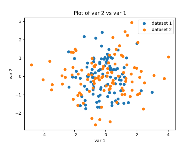
Finally, we’ll include multiple datasets on one graph and include a legend using the label keyword argument. The legend object in matplotlib can be placed differently in the plot depending on the data. In order to create a bigger distinction between the two datasets, we will generate x3 and double the values so that the placement will vary.
x3 = np.random.randn(100) * 2
x4 = np.random.randn(100)
plt.scatter(x, x2, label='dataset 1')
plt.scatter(x3, x4, label='dataset 2')
plt.xlabel('var 1')
plt.ylabel('var 2')
plt.title('Plot of var 2 vs var 1')
plt.legend()
plt.savefig('scatter_w_legend.png')
Here are some other helpful hints. Between graphs, you can use plt.clf() to clear the graphs, as using plt repeatedly uses the same figure object. Alternatively, if you are working in an interactive notebook, you can use %matplotlib inline so that graphs will appear as you go.
Histograms and scatter plots will give you a good starting place, but remember the official Matplotlib documentation is full of examples and other uses.
Happy plotting, and check out some of our other posts on GinkgoBits!
(Feature photo by Conny Schneider on Unsplash)